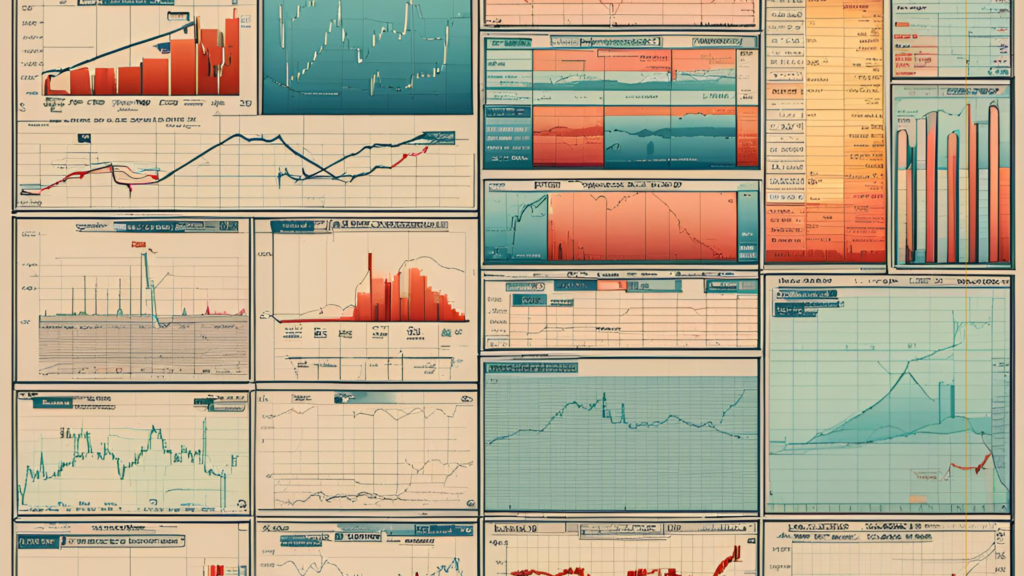
What types of charts do you know? The oldest type of chart is candlesticks. Candlestick charts originated in Japan in the 18th century. This method was developed by a Japanese rice trader named Munehisa Homma in the early 1700s. Homma devised candlestick charts for analyzing and predicting rice prices, and his methods not only endured but became the most popular in the world.
The newest type of chart is the Heikin-Ashi candles. While candles originated in Japan, Heikin-Ashi candles were introduced to the world by Romanian financial analyst Dan Valcu in February 2004 after publication in the specialized journal Technical Analysis of Stocks & Commodities.
By the end of the 19th century, there was a surge in new types of charts. This was primarily due to the development of the stock market in both America and Japan. In America, bars appeared, which are a more modest replication of Japanese candlesticks. Like candlesticks, they display price development within a specific time interval based on OHLC parameters: Open price, High price, Low price, and Close price.
A line chart displays the change in just one price over the given time interval, typically the closing price of your choice from the OHLC set. Personally, in terms of charts that display price dynamics over time, it is the most convenient. In practice, I still monitor the closing price because why clutter the chart with unnecessary information? The closing prices of previous intervals are still available. All unseen fluctuations between adjacent closing prices can be attributed to what is known as market noise.
The desire to eliminate market noise led to the creation of price charts that are independent of time and directly dependent on price fluctuations. Around the same time, American and Japanese traders created charts depicting price movement based on volatility. In America, these were Point & Figure charts, while in Japan they were Kagi, Renko bars, and Three-Line Break charts. Point & Figure charts perhaps combine Three-Line Break with Renko bars. These bars allow you to manually set parameters for the value changes of the financial asset that are important to you. After all, during the time spent in the market, we can only earn on options if the price stays at a level that is profitable for us. In other cases, the actual price change per unit of time, i.e., the volatility of the financial instrument, is important. The disadvantage, which is obvious to me, is that in many systems, bars based on volatility are constructed based on the closing prices of the time interval on which the bar is considered. This nullifies all the advantages of this type of bar unless you are building a graph based on tick chart.
And finally, let’s talk about bars that appeared on the market with the development of electronic trading. Bars based on market activity or bars dependent on traded volume. Let me explain. Bars based on price change over time equate a bar that traded a large volume, say $100 million, with a bar in which a volume a thousand times smaller was traded in the specified time. Bars based on activity allow you to adjust the display so that a new bar displays either a specific number of transactions or contains a specific volume.
For those who want to study graphic analysis in more detail, I would recommend books by Steve Nison: “Japanese Candlestick Charting Techniques” and “Beyond Candlesticks: New Japanese Charting Techniques Revealed”, Thomas J. Dorsey’s “Point and Figure Charting: The Essential Application for Forecasting and Tracking Market Prices”, and Hank Pruden’s “Point and Figure Charting: The Complete Guide”.
Each type of candle has its pros and cons; no chart guarantees 100% profit. But it’s within our power to remove from the chart what we don’t use.
Best regards.